CLIENT
Café Risico
THE QUICK TAKE
I created new restaurant menu concepts, outdoor posters, and an updated logo for Café Risico’s new branch in Copenhagen, Denmark.
MY ROLE
Graphic Design
Visual Identity
Art Direction
Outdoor Marketing

CASE STORY
Café Risico is a café and restaurant chain in Copenhagen with a legacy of great food and drinks for over 30 years. In 2020, they opened a new store in the heart of Amager.
With a new location and audience, they sought to update the visual identity for their new branch to appeal to a new, younger demographic.
Project Goals
Update the general art direction
Design a brand new restaurant menu
Create new outdoor posters for promotion
Create an updated version of the Café Risico logo
Menu Design Concepts
PROCESS
I started out experimenting with a tall, folded menu layout—similar to their old menu—where I sectioned each food and drink category into containers. This was to provide customers, who would often get lost in the menu, with a more organized overview of the plentiful menu. I also presented the client with a selection of fonts to choose from, which I believed would give the café a slightly more modern style and subsequently move away from their previous designs.
As progress continued, I proposed that an A3-sized poster menu could potentially be more suitable for a modern café and easier to navigate for their customers. The client agreed to the change, and most of the font styles were carried over, with a new serif font added for the category headings to make them stand out more. The client eventually opted for a folded A4 double spread, which I accommodated for.
Outdoor Posters
PROCESS
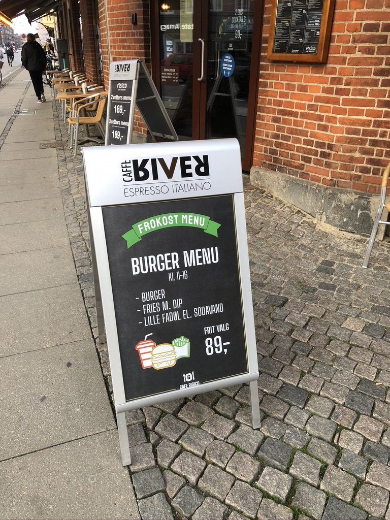
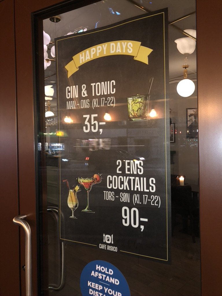
With their new location, the client wanted to appeal to the new, younger demographic, by advertising offers made specifically for the new audience.
As the main focus was to highlight new offers and attract locals, the posters had to be visible and legible even from a distance. I decided to use a mixture of a chalkboard background, colorful illustrations, and a white, bold font, to make all the elements stand out.
Due to time constraints, the client wanted the posters as soon as possible, and I was able to finalize and deliver the designs in a day.
Key Takeaways
NEW VISUAL IDENTITY
With the combination of a completely redesigned restaurant menu and new outdoor marketing posters, I sought to upgrade Café Risico’s visual identity, which had largely remained unchanged since its inception in 1990.
Sporting a brand new look, the goal was to elevate the new branch and, If successful, the project would eventually be expanded and adopted by the other branches.
LEARNINGS
It was a huge challenge to attempt to build upon a brand with decades under its belt and, at the same time, create something that could attract the thousands of people passing by Café Risico daily.
In the end, it was a great learning opportunity, where I had the creative freedom to determine the art direction and work with branding. It also helped me become more acquainted with outdoor marketing and print designs, as well as being an interesting opportunity to help shape Café Risico's brand in the years to come.
Credits:
Cafe Risico
DrawKit
Design tools:
Figma
Photoshop


