CASE STUDY
Oreo X DBU World Cup 2022 - 360° Marketing Campaign Concept
THE QUICK TAKE
In a project from dentsu X Denmark, I had 1 week to build a campaign concept for Oreo and DBU (Danish Football Association) for the 2022 World Cup in Qatar. The goal of the campaign was to promote Oreo in tandem with the Danish football team during the World Cup through a digital game — to create attention and engagement of the collaboration.
DELIVERABLES
Key visual, SoMe banner, FB/IG stories, digital ads, digital game mockup
DESIGN AREAS
Graphic Design
Motion Graphics
Art Direction
Social Media Content
Campaign Production/Planning
APPLICATIONS
Adobe Photoshop, After Effects, Illustrator, Figma

CASE STORY
In association with dentsu X Denmark, I brought together the brands of Oreo and DBU for a 360° marketing campaign, to coincide with the 2022 World Cup. With “Stay Playful“ as the tagline, the goal of the campaign was to create a playful way for Danes to support their football team through Gen Z’s most loved food brand, Oreo.
The leading actor behind the campaign was a digital game and contest, which aimed to drive engagement and awareness of the campaign, as well as motivate the audiences to interact/play with the collaboration.
To get the word out, campaign visuals such as social media banners, animations, and digital ads were created with Call-to-Action in mind, directing the target audience to the digital game landing page.
Project Goals
Design a key visual that combines both brands for announcements & outdoor
Create banners and animations to raise awareness of the collaboration across social media channels
Develop mockups for a digital game that enable audiences to engage with the campaign
Produce CTA digital ads to motivate audiences to try out the digital game and win prizes

Design Process
DESIGN GUIDELINES
During the creation process, I aimed to develop a design guideline reminiscent of Oreo’s own style, and injected with references to football and DBU. The background colors for the visuals was created using a gradient of light and dark blue, similar to those found in Oreo’s logo, and familiar to previous campaign visuals, as seen below.
As many of Oreo’s previous campaigns rarely feature people, I also chose not to include any Danish football players in the visuals, despite the players being the symbol of DBU. No references were made to Qatar as well, to avoid the negative press surrounding the World Cup. The focus of the campaign (and visuals) was therefore solely on creating a fun way for Danes to support their team through Oreo.
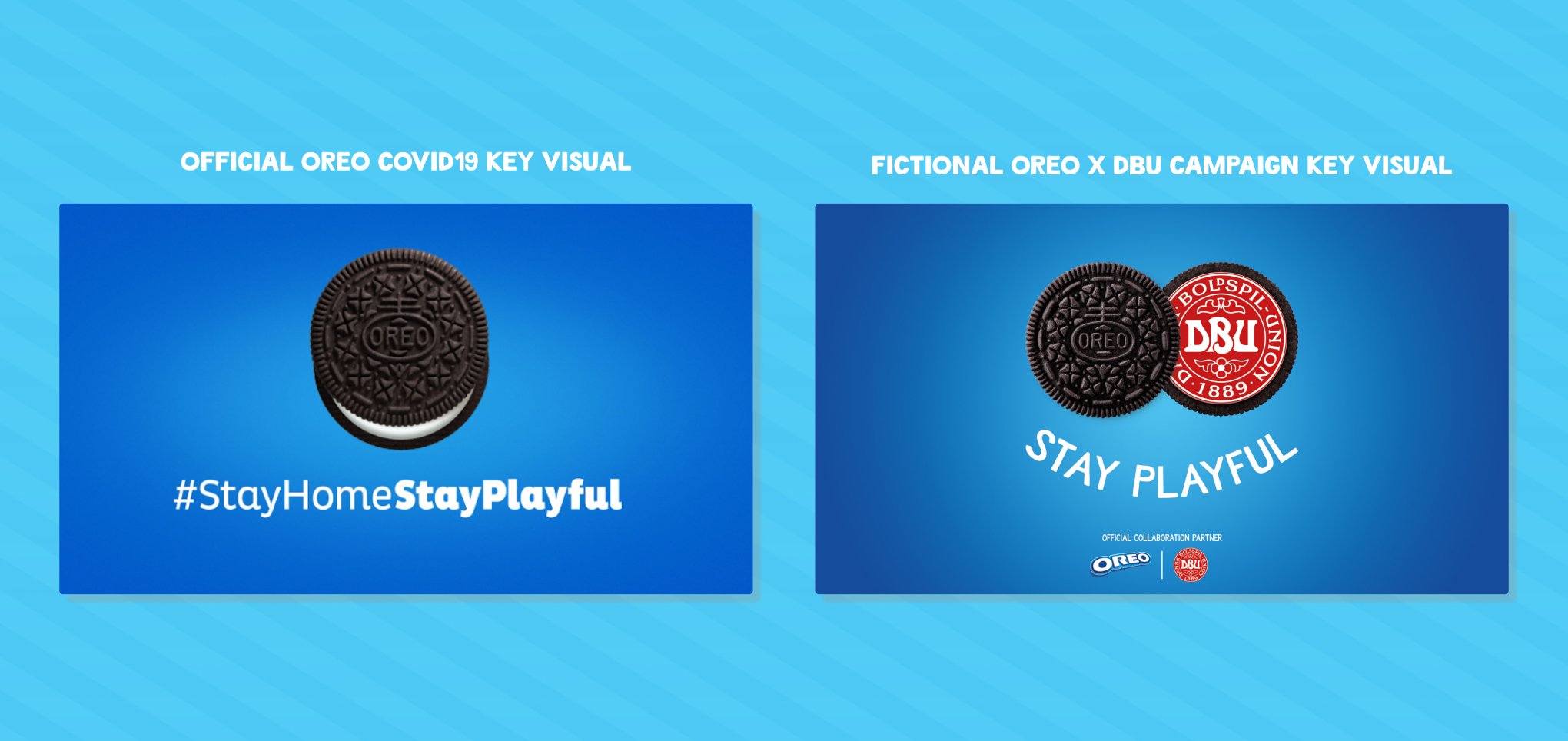
KEY VISUAL COMPARISON
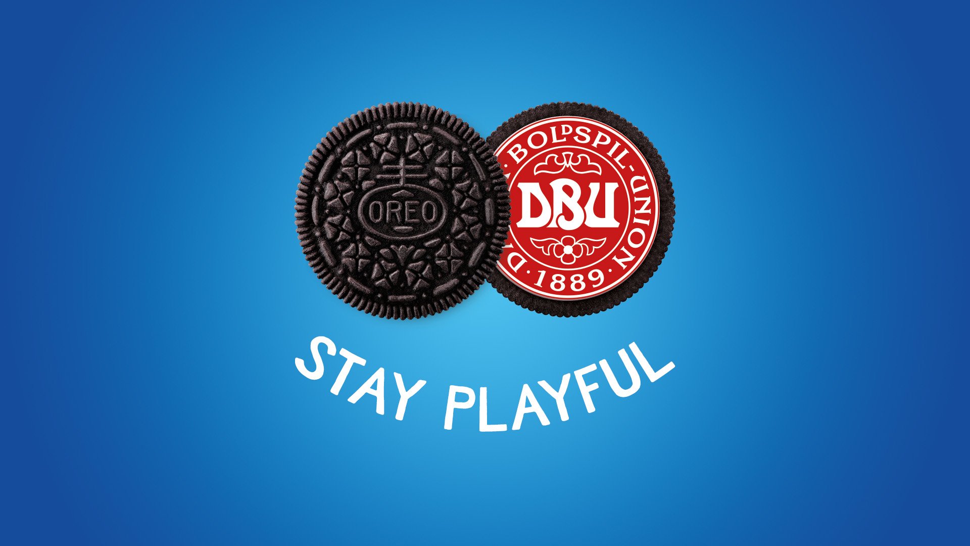
In the key visual above (right), an Oreo cookie is shown, revealing DBU’s logo which has replaced the cream inside the cookie. This is followed by the tagline “Stay Playful“ in a curved arc.
This is meant to showcase the collaboration between the two brands and symbolize DBU’s football values empowering Oreo from within, as well as Oreo being the sender.
Together with the tagline, “Stay Playful“ in white, the visual forms a smiley face, which is a homage to Oreo’s own iconic trademark—creating a smile using the cream—as seen in the left key visual above.
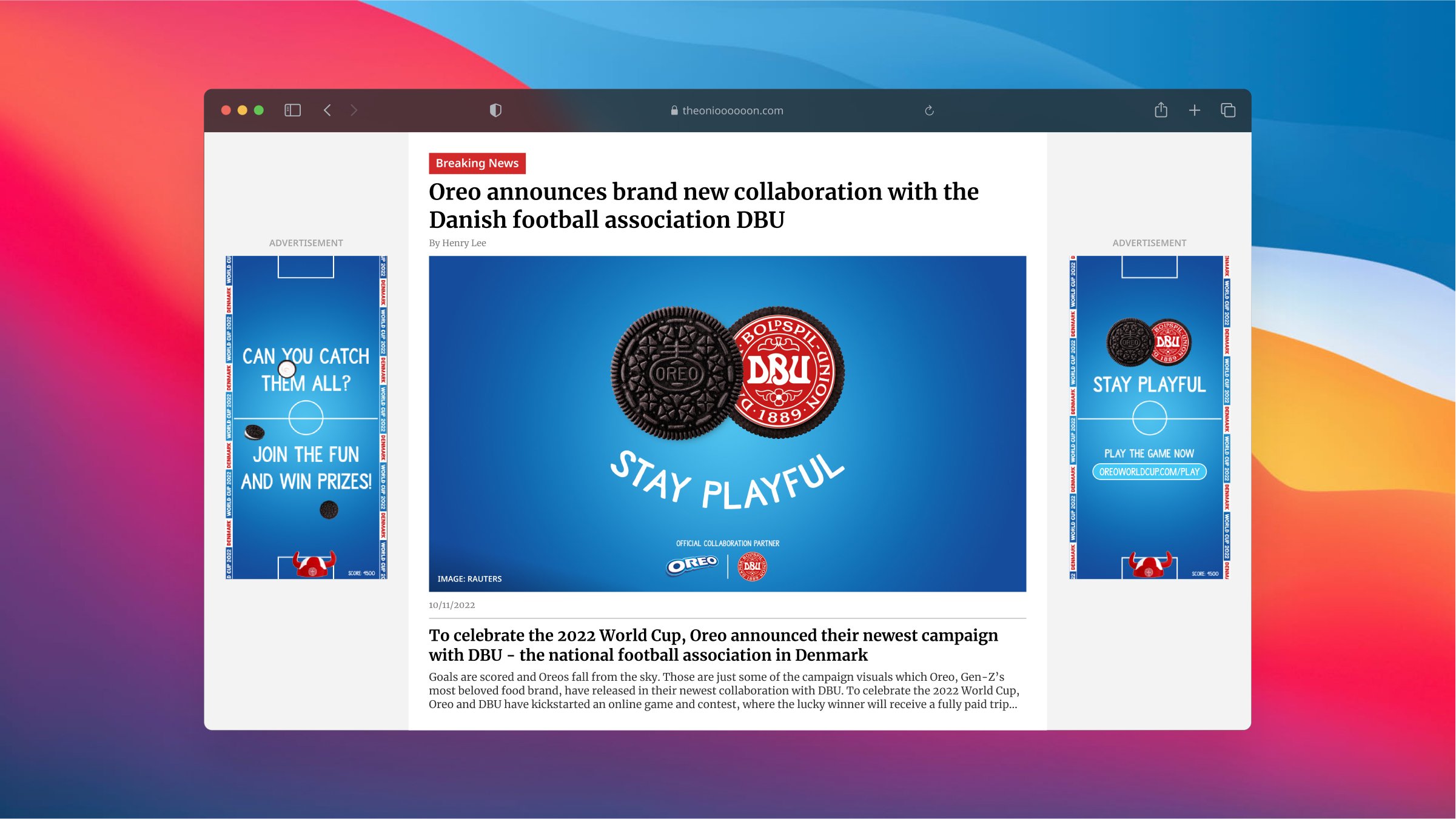

MOTION GRAPHICS FOR SOCIAL MEDIA AND ADS
In order to reach the main target audience—Gen-Z, I opted to create animated banners, as opposed to static banners, to appeal to their infamously short attention span on ads/SoMe feeds.
The main idea was to bring a football twist to the Oreo brand, which resulted in using Oreo cookies to mimic footballs on a field, and having them roll/bounce into the goal.
A short animation for Facebook/Instagram stories (below, left) showcases this, and features an Oreo rolling into a goal, where it splits to show DBU on the inside. This is followed by an encouraging message and CTA link to the digital game.
In addition, an animated ad was created to show the digital game in action (below, right), to make the audience familiar with how the game worked. It also sought to draw their attention through the moving elements and arouse their interest through motivational, competitive messages that promises fun and prizes (Can you catch them all?; Join the fun and win epic prizes!).
